The Power of Color in Staging a Home

The Power of Color in Staging a Home

Photo by: Staging That Sells

It’s that time of the year when we get to enjoy an array of colors as spring ushers in a new season. As the real estate market typically blossoms in March, now is the time to seriously think about how we can use color to sell a home.

When staging a home for sale, color is the key!

How we work color into a staged home can affect how potential buyers connect with a home. We wouldn’t think it would matter, but emotions play a vital role in the home buying process, and that starts with color.  Color experts agree that colors have an impact on our feelings. Each color sends a psychological response to our brains. Some make you feel relaxed or energized, while others may even make you feel hungry.

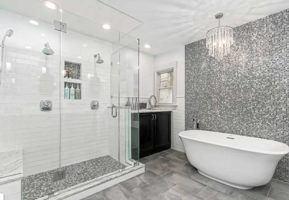
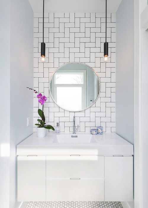
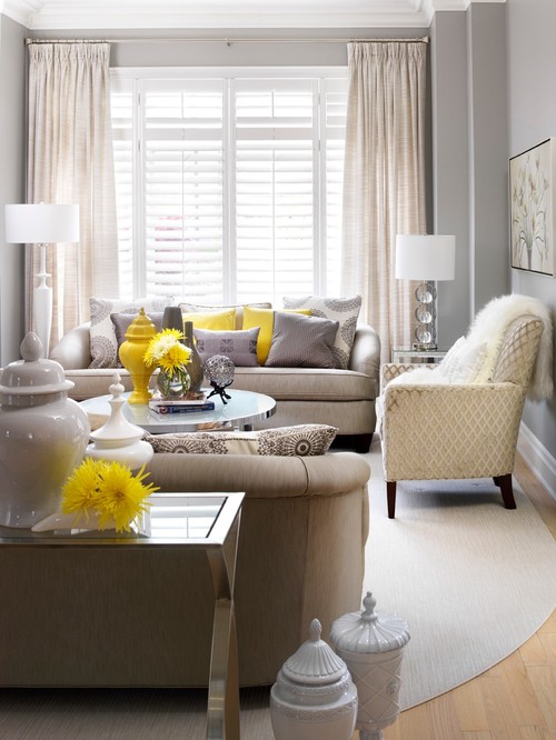
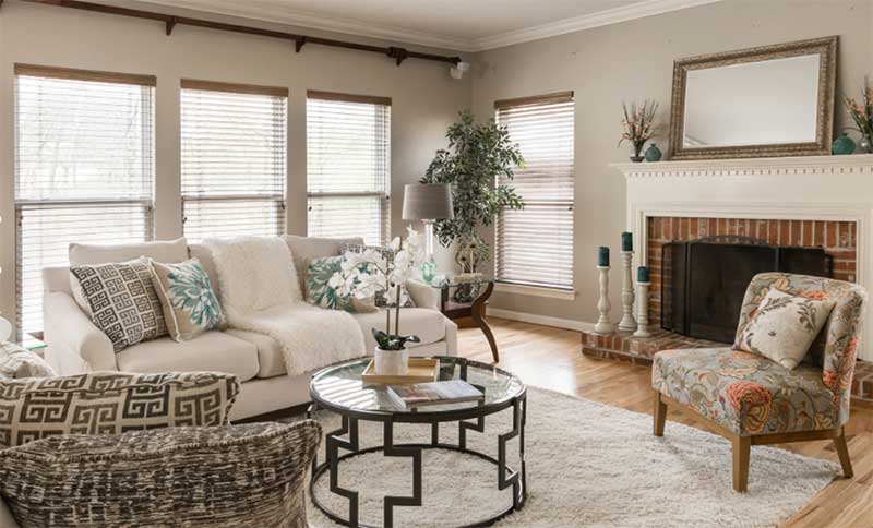
Each homeowner is different, and we can never be sure what color will evoke an emotion. This is the reason we suggest starting with a neutral color palette. By using neutral colors, we can highlight the home’s unique selling features, allowing potential buyers to visualize themselves living in a space. Think of it like we’re enabling their imagination to work with a blank canvas that they can fill with their own color choices.

Walls and trim are the perfect places to neutralize color.

Shades of cream, beige, and white allow a home to feel bigger and brighter. Even if these colors seem a tad bit boring to you, remember we’re trying to let the home buyer envision their own color palette.

Once we’ve neutralized the space, now we can add splashes of color throughout the home to add charm and character.

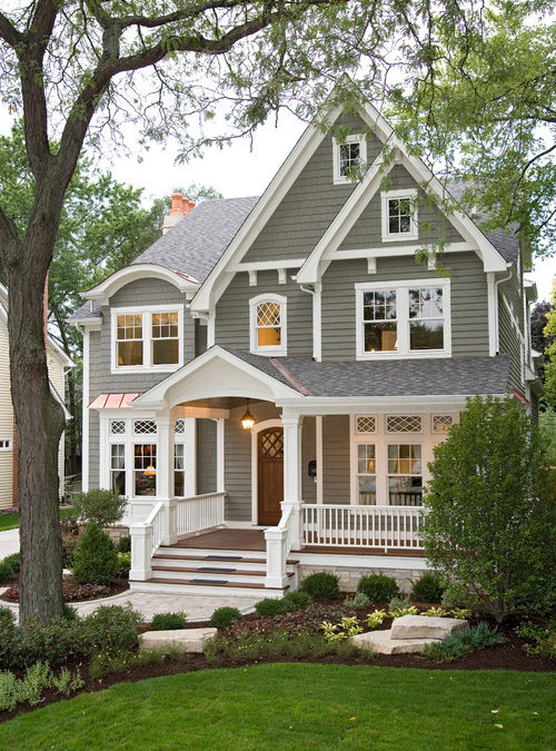
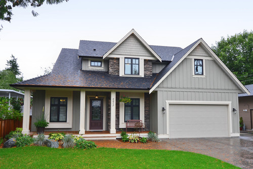
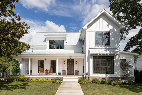
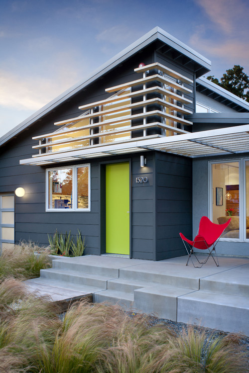
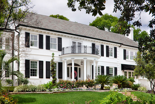
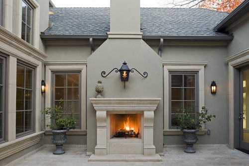
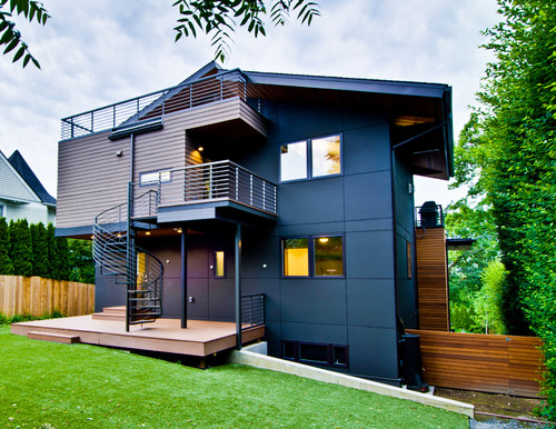
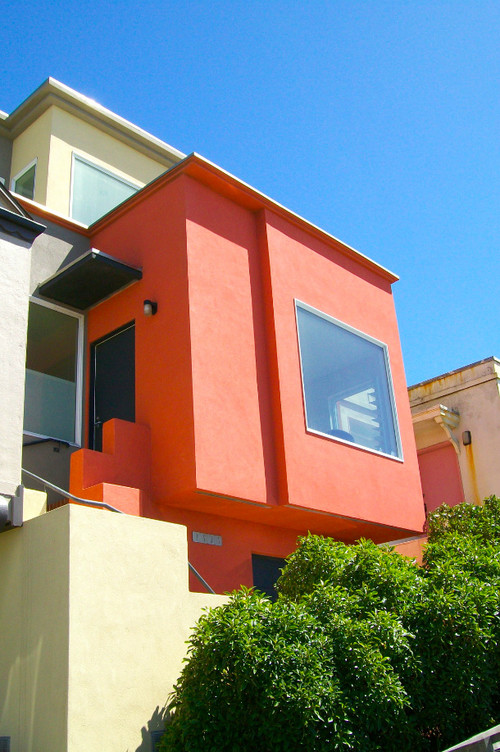
A great impression starts at the front door.

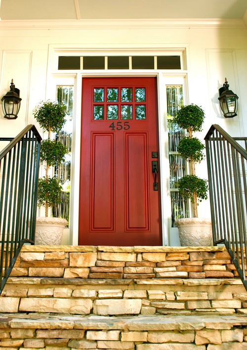
Show-stopping colors like red, green, yellow, and blue can make an impactful statement when done correctly. Using colors that attract attention and create a stunning first impression can often lure homebuyers in the front door. Not all bold shades work well with your home’s exterior color palette or surrounding landscape, so it’s best to consult with a color professional if you’re unsure.

Homebuyers want to see some color.

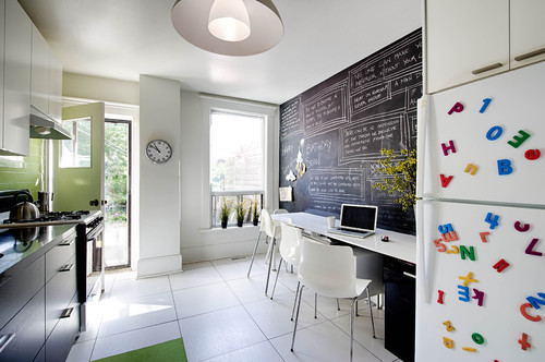
Even though this may sound counter-intuitive to staying in a neutral color palette adding color in areas that highlight a home rather than overtake, it is just as important. It’s all about moderation and can, in all regards, make a home feel more inviting.

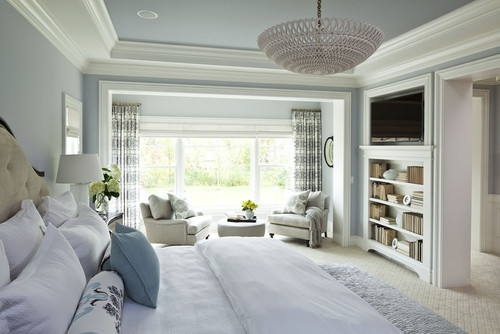
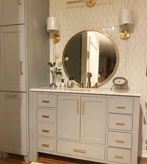
We can even use color to make a room look more appealing. Blue typically makes a room feel more relaxing and is perfect to use in bedroom areas. Orange, on the other hand, can make a space feel energized, and red is powerful and eye-catching.

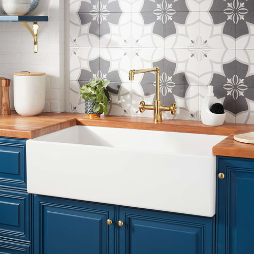
By inserting color through art and accessories, we can add subtle splashes of interest by taking advantage of using the natural walls as a backdrop. A beautiful vase of flowers can add a nice touch to a countertop or coffee table. Colorful pillows or a pretty bedspread are great for adding soft color touches throughout the home.
 

One important thing to remember is we’re trying to highlight the home, not the décor, so use color sparingly.

Color can also be used to lead a buyer’s attention to unique home features.  A strategically placed vase of flowers under a pretty chandelier can draw a buyer’s attention upward. A colorful bowl of fruit on a kitchen counter can draw attention to a tiled backsplash, and even colorful books and art can show off a built-in bookshelf.

Color can also draw attention away from those less than appealing areas. For instance, maybe the view from a window is less than beautiful. Hang a piece of colorful artwork nearby to take the attention away from the window and into the artwork.

Use the thumb-stopper approach.

Keep in mind today’s buyer is Internet savvy and will use listing photos as a guide to schedule a viewing. Color can make an impactful statement in photos if used properly. We need to entice a buyer to stop scrolling and take notice. Home staging and, more importantly, knowing how and when to use color will keep your MLS listings looking appealing and keep a steady stream of homebuyers’ interested in your property.

Melanie Serra, Interior Designer & Home Stager
Melanie Serra, Interior Decorator, Certified Color, Redesign and Staging Instructor

Award-winning decorator and stylist Melanie Serra has been reviving interiors for over 17 years and has worked with clients in Dallas, Philadelphia, and Atlanta. Melanie Serra’s approach to interior design is fresh and innovative transforming residential and commercial interiors from Now to WOW!

Melanie Serra Interiors - 770-714-3430

Tips in Picking Grout Colors & Tile Pattern

Tips in Picking Grout Colors & Tile Pattern

Photo by: LEAN Home Remodeling

You’ve spent hours combing through your favorite blogs and websites looking for samples and advice on picking the perfect tile. Now that you’ve chosen the tile, the next step is to decide on the installation pattern and the grout color.

Easier said than done, right?

Often, my clients ask me how to select the correct grout color.

These are a few things to consider:

 The first thing in selecting a grout color is to determine if the tile is going on a wall or floors?


On floors, the grout will get dirty due to heavy traffic patterns, so you’ll want to stick with a medium or dark grout color. That goes the same for kitchen walls, especially near cooktops and ovens where food or grease splatter.

Another thing to consider is the room size.

When choosing a color, keep in mind that grout that is contrasting with the tile will often create a busier look.  This can make the room appear smaller.


Next, determine if you are going for more of a subtle (monochromatic) look or if you want to add drama with a grout pattern.

You have three choices:

1. Make the grout disappear- Select a grout color that closely matches the tile or the background color of a patterned tile so the grout blends in. If you are a fan of white subway tiles, you may want to consider using white, off white, or light gray grout. This combination creates a classic and timeless look.


2. Create a pattern with the grout -Select a grout in a contrasting color to accentuate the installation pattern (such as staggered, herringbone or brick layered patterns). The popular subway tile of white tile and dark grout is by far one of the most popular choices. But I suggest taking it up a notch by reversing to dark tiles and white grout or even adding metallic or glitter-like flecks to your grout.


3. Select a grout as an accent color- I often like to use a color not found in the tile itself. For instance, I might use a grout color that picks up a color in the countertop, or in an accessory in the room to create a color palette. The picture below is of my master bathroom renovation. I selected harvest gold for the grout color. Then I added yellow, gold, silver and bronze in the accessories and fixtures. (This project is near completion, I’m just waiting on the mirror to be hung).

Mel's Bathroom

glitter grout

Need some help? Feel free to call me and let me take the guesswork out of choosing the perfect grout color.

Melanie Serra, Interior Designer & Home Stager
Melanie Serra, Interior Decorator, Certified Color, Redesign and Staging Instructor

Award-winning decorator and stylist Melanie Serra has been reviving interiors for over 17 years and has worked with clients in Dallas, Philadelphia, and Atlanta. Melanie Serra’s approach to interior design is fresh and innovative transforming residential and commercial interiors from Now to WOW!

Melanie Serra Interiors - 770-714-3430

Choosing the Right Gray Paint

Choosing the Right Gray Paint

Gray ” it’s” the trendiest color of the moment. 

What was previously thought of as a gloomy day color, gray is now the picture of sophistication and elegance, the go-to neutral.

How do you go about choosing the right gray paint?

It’s definitely the most difficult color to pick.  It can look baby blue to beige to purple depending on the light and placement.  Here are a few tips on how to choose the right gray paint for your room! (more…)

What color should I paint my house exterior?

What color should I paint my house exterior?

Pick-a-Paint Tips – How to pick a house paint color.

Each home has a unique calling card of its own, whether it’s a classic Bungalow or a charming Tudor. It’s just a matter of time before a house needs a fresh coat of paint to recapture its classic characteristic charm. The perfect exterior color palette goes a long way in providing curb appeal and creating a neighborhood showpiece.

How to pick a house paint color?

When you factor in the thousands of color choices and their values it can be a daunting task. On top of that, one must understand undertones and how color reacts to light, texture and weather conditions.

Selecting the wrong exterior paint colors can affect the entire neighborhood. So it’s important to get it right the first time to avoid costly mistakes and humiliation. The tips below can provide color confidence in selecting the perfect exterior color scheme.

Pick Just Three

When narrowing down your exterior color choices, keep it to just three.


Field Color
– Large areas such as siding (hardie plank). The field color will be the base for choosing your trim and accent colors.


Trim Color
– Corner boards, window trim, fascia, etc. Trim color can make or break your color scheme. Keeping trim lighter than the field color is always a safe bet. Pay attention to trends such as with the new farmhouse style where it is common to paint gutters, downspouts, and windows in dark brown or black. This is a great look, however, trends come and go. So, if you are planning to sell in a few years its best to select white or neutral.


Accent Color
– Doors, shutters, and other architectural features. The accent color is where you can incorporate a bit of personality. An eye-catching accent color can give an otherwise muted color scheme pizzaz.

Use Fixed Elements as a Guide

This is the jumping off place to start your color palate. Use a fixed element such as the brick, mortar, cedar shakes, stone, pavers, roof shingles, wood columns etc. to establish the color scheme. There is usually more than one color (undertone) in natural materials. Once you decide on the hue, be sure to hold the paint chip next to the material to get an accurate match.


Factor in the surrounding area.

Something people often forget to do is factor in the colors around their house. Maybe you have a cherry blossom tree in your front yard that you could match your house? Or do you have a colorful path leading up to your house? The biggest thing to consider is your garage because if the house doesn’t match the garage then it can make the whole house look off. If you have an oak garage (and if you don’t I recomend looking at oak framed garages prices because they can make your house look stunning) then it’s best to go for darker greens or shades with gray undertones. There are a lot of things to consider.

Go for the Classics

When it comes to choosing a timeless color combination, nothing works better than the classic white or ivory with a black accent.

Vary Color Hues

The value of a color is the lightness or darkness of the same hue. Often people will call this a shade, but that is incorrect color terminology. Shade is a color with black undertones. Some of the prettiest color combinations are those that play with different values of the same color.

Make a Statement with Color

Color is your friend! Don’t be afraid to be brave and daring. This homeowner went bold and classic!

Highlight the Architecture

If your home’s most prominent feature is its architectural form, then use paint colors to highlight its uniqueness.

A final note….

Just as important as picking a color palette that works in your neighborhood and the surrounding landscape, testing your color choice is vital. Painting your home is a big undertaking and is not as simple as re-painting an interior room. It can be a costly mistake.

Never rely on paint chips alone when choosing a paint color for your home.

Find an inconspicuous area of your home where you can paint test swatches. Paint a large area and watch how the light changes its hue at different times of the day and in different weather conditions.

If picking an exterior paint color seems too overwhelming give your Atlanta, GA Color Consultant, a call and let’s tackle it together. During a color consultation, I create a cohesive color palette that will compliment your homes best exterior features while keeping in line with its individual character.

Melanie Serra, Interior Designer & Home Stager
Melanie Serra, Interior Decorator, Certified Color, Redesign and Staging Instructor

Award-winning decorator and stylist Melanie Serra has been reviving interiors for over 17 years and has worked with clients in Dallas, Philadelphia, and Atlanta. Melanie Serra’s approach to interior design is fresh and innovative transforming residential and commercial interiors from Now to WOW!

Melanie Serra Interiors - 770-714-3430