Tips in Picking Grout Colors & Tile Pattern

Tips in Picking Grout Colors & Tile Pattern

Photo by: LEAN Home Remodeling

You’ve spent hours combing through your favorite blogs and websites looking for samples and advice on picking the perfect tile. Now that you’ve chosen the tile, the next step is to decide on the installation pattern and the grout color.

Easier said than done, right?

Often, my clients ask me how to select the correct grout color.

These are a few things to consider:

 The first thing in selecting a grout color is to determine if the tile is going on a wall or floors?


On floors, the grout will get dirty due to heavy traffic patterns, so you’ll want to stick with a medium or dark grout color. That goes the same for kitchen walls, especially near cooktops and ovens where food or grease splatter.

Another thing to consider is the room size.

When choosing a color, keep in mind that grout that is contrasting with the tile will often create a busier look.  This can make the room appear smaller.


Next, determine if you are going for more of a subtle (monochromatic) look or if you want to add drama with a grout pattern.

You have three choices:

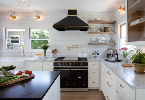
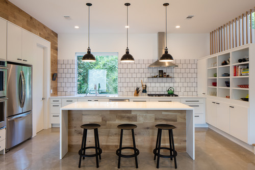
1. Make the grout disappear- Select a grout color that closely matches the tile or the background color of a patterned tile so the grout blends in. If you are a fan of white subway tiles, you may want to consider using white, off white, or light gray grout. This combination creates a classic and timeless look.


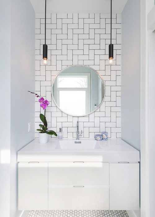
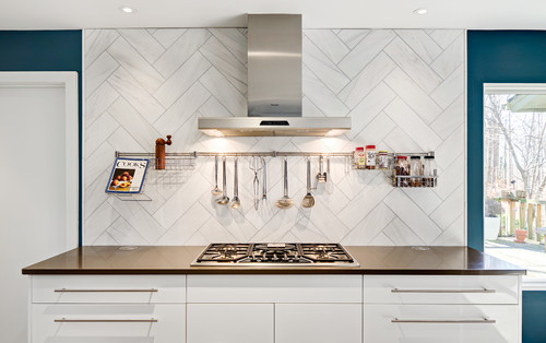
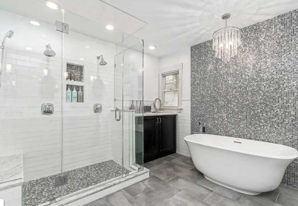
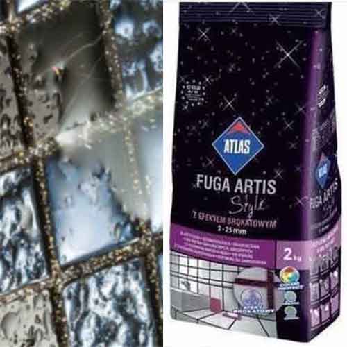
2. Create a pattern with the grout -Select a grout in a contrasting color to accentuate the installation pattern (such as staggered, herringbone or brick layered patterns). The popular subway tile of white tile and dark grout is by far one of the most popular choices. But I suggest taking it up a notch by reversing to dark tiles and white grout or even adding metallic or glitter-like flecks to your grout.


3. Select a grout as an accent color- I often like to use a color not found in the tile itself. For instance, I might use a grout color that picks up a color in the countertop, or in an accessory in the room to create a color palette. The picture below is of my master bathroom renovation. I selected harvest gold for the grout color. Then I added yellow, gold, silver and bronze in the accessories and fixtures. (This project is near completion, I’m just waiting on the mirror to be hung).
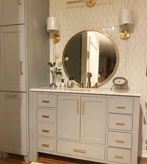
Mel's Bathroom

glitter grout

Need some help? Feel free to call me and let me take the guesswork out of choosing the perfect grout color.

Melanie Serra, Interior Designer & Home Stager
Melanie Serra, Interior Decorator, Certified Color, Redesign and Staging Instructor

Award-winning decorator and stylist Melanie Serra has been reviving interiors for over 17 years and has worked with clients in Dallas, Philadelphia, and Atlanta. Melanie Serra’s approach to interior design is fresh and innovative transforming residential and commercial interiors from Now to WOW!

Melanie Serra Interiors - 770-714-3430

On Trend – The Tuxedo Kitchen!

On Trend – The Tuxedo Kitchen!

Let’s face it, picking a kitchen cabinet color can be quite daunting.

Most of the time when making cabinet color selections, clients go the safe route with white or neutral. But neutral can be a bit boring! What if there was a way to incorporate color into your kitchen cabinets to create that wow factor? I’m here to tell you how!  Go two-tone! Yep, that’s right! It adds a dimension and lets you explore a little bit of color, without overdoing things. One of the hottest trends today in kitchen design is the “tuxedo look.” This design concept offers a timeless style, and universal appeal while adding elegance and simplicity to the most used room in your home. Indulge yourself with color, and I bet you won’t bore of it quickly. By choosing two-tone, you’ll add a dimension that allows you to get a little braver with color without overdoing it.

Tuxedo cabinets are versatile too.

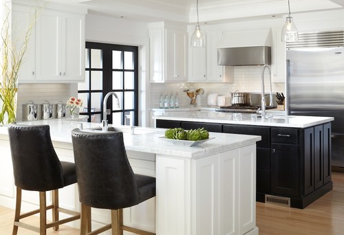
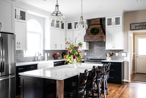
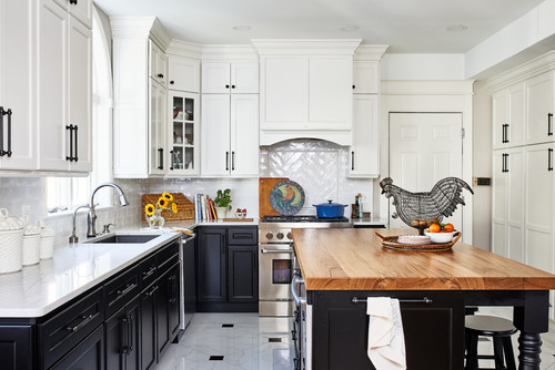
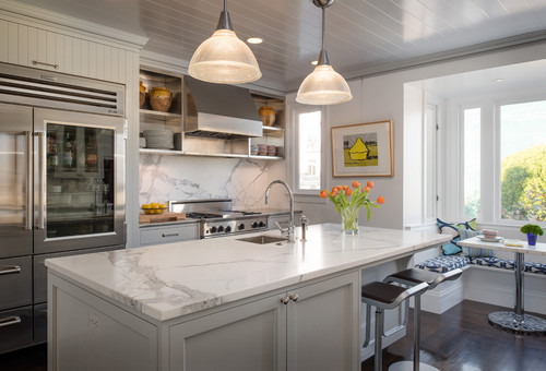
Although you might not think it at first, tuxedo cabinets are incredibly versatile.  This latest trend will transition well with any cabinet door style and looks great in both traditional and contemporary kitchens. A classic tuxedo kitchen is typically defined by white upper cabinets and often incorporates a black island. However, the color choices and the degree of contrast you choose is completely up to you. Tuxedo cabinets are more about creating exactly the look you envision, so they don’t have to be just black and white. Tuxedo cabinets can be any combination of light and dark or two-toned.

A two-toned look is both chic and timeless.

A tuxedo kitchen ups the room’s sophistication without requiring a great deal of time and effort to transform the space. For small kitchens, the look can also brighten and open up the room. Tuxedo kitchens break up the monotony of all one color cabinets. These days the open concept kitchen is more about visual appeal and creating a living space than about being solely utilitarian.

I’m here to tell you it’s simpler than you think. All you have to remember is go two-tone.

Here are some of my favorite tips in making this design style work for you:

Keep in Simple

The most classic way to incorporate this style is to go with the basic black and white. This is defined by the traditional black bottom cabinets paired with its white upper cabinets. This color combination is both chic and timeless. If your kitchen is small, this look can open up the room and make it feel bigger.

Add pops of color

Keep it fun by adding pops of color that keep the eye moving throughout the room.
 

Harmonize the Colors


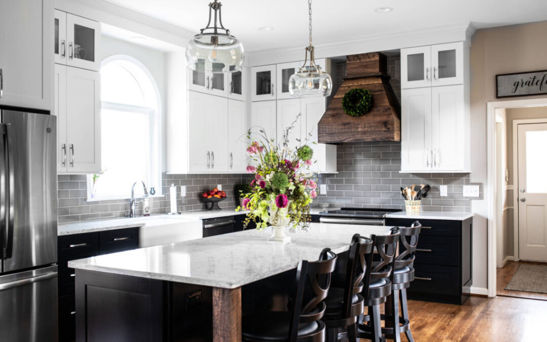
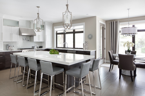
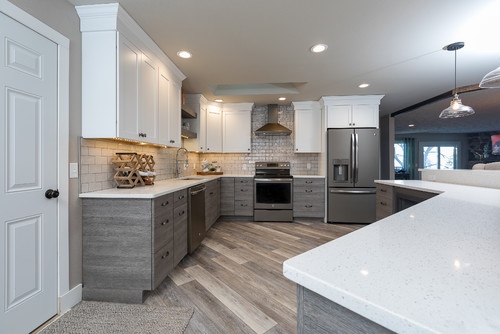
Add character to a tuxedo kitchen by using two contrasting colors.  In this photo, the gray subway tiles were added to the entire wall, not just the backsplash, which helps tie the dark and light colors together.
 

Glimmer and Shine

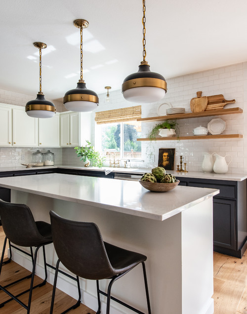
Light-reflecting metallics make the perfect statement in eye-catching areas throughout a tuxedo kitchen. Over a breakfast bar, on the walls, and in accessories add just enough glimmer to add a touch of class to the room.

Go for a Cohesive Look

Matching hardware, tapware, and light fixtures throughout the room will give it a unified look.

Highlight Natural Elements

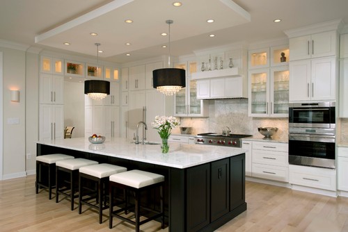
Floor to ceiling cabinets make the perfect backdrop for mixing in natural elements. Wood is the ideal material to soften the contrasting colors in a tuxedo kitchen.

Make Lighting the Focus

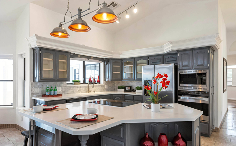
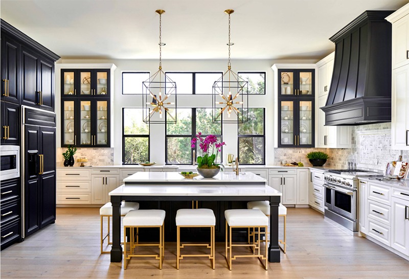
In this stunning design, the kitchen begs for luxurious lighting to heighten the drama of the room. Add spectacular lighting that will illuminate the space after dark and highlight its architectural details.

You don’t need to stick to the sleek and modern look of the classic tuxedo design.

As long as you are contrasting colors, you can create a sophisticated room that will be the highlight of your home.

Is your kitchen looking tired?

Are you bored with your current look? Want to transition into a sleek style without spending a fortune? ? Go Tuxedo! Its just paint! It the cheapest decorating tool and can transform your Kitchen from now to WOW!!!!

Melanie Serra, Interior Designer & Home Stager
Melanie Serra, Interior Decorator, Certified Color, Redesign and Staging Instructor

Award-winning decorator and stylist Melanie Serra has been reviving interiors for over 17 years and has worked with clients in Dallas, Philadelphia, and Atlanta. Melanie Serra’s approach to interior design is fresh and innovative transforming residential and commercial interiors from Now to WOW!

Melanie Serra Interiors - 770-714-3430
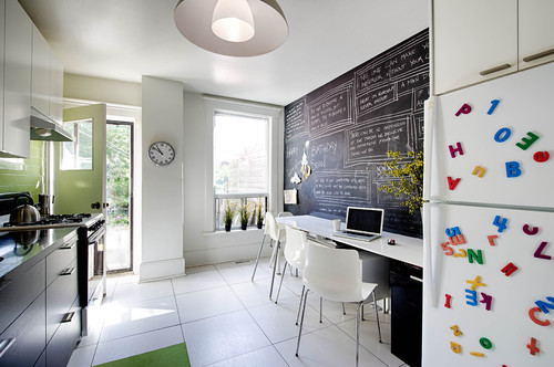
Kitchen Trends for 2019 -Part 2

Kitchen Trends for 2019 -Part 2

Part 2 – Kitchen Trends for 2019

tile backsplash

A Fresh Look to Something Old

Subway tile is still very popular. However, pattern and installation are key. We are seeing kitchen backsplashes (and shower stalls) in herringbone, stacked, crosshatched and chevron patterns.  Darker grout in gray, navy and black make the pattern more pronounced.

Indoor/Outdoor Kitchens…

are creating a buzz! Designers are finding new ways to expand the kitchen to the outdoors.  Instead of the typical single door, they are creating disappearing walls with large sliding and collapsible doors to increase living space. Homeowners love this blurring of inside and out.

Corner countertop cabinets

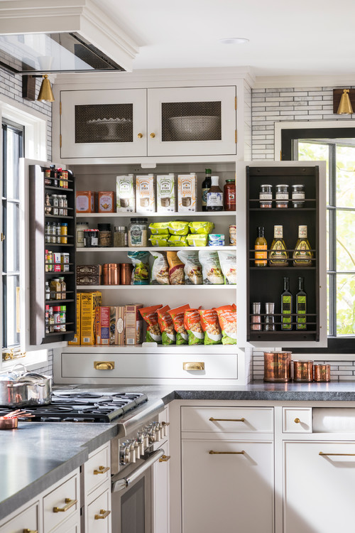
Dead space, and hard to reach kitchen cabinets are being revived and transformed.  Now ceiling to countertop cabinets are being designed and anchored with a bottom drawer. These new corner cabinets create the perfect storage for those quick-grab items that were hard to find or reach.

Black is Back!

For years designers and color consultants have been confident that black can turn any room into an elegant and luxurious showpiece. Homeowners are finally embracing the dramatic color in their kitchen. Black cabinets, paired with white walls, countertops, and backsplashes are adding a high-end, sophisticated look to new kitchen designs.

What’s Your Angle?

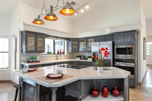
Typically, most kitchen islands are rectangular in shape.  New kitchen layouts are being created to modify the shape of the room and to include more work and storage space.  Good design means throwing away convention and stepping out of the square …or in this case, the rectangle box.

Moroccan Tile

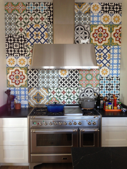
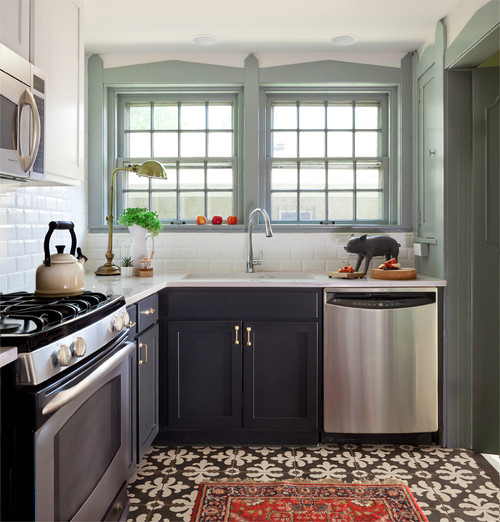
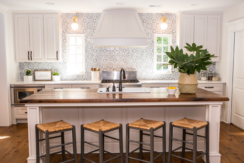
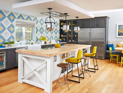
For the floor or backlash, Moroccan tile is the newest take on tile. Whether your style is traditional, eclectic, or contemporary, there’s a way to incorporate Moroccan inspiration into your kitchen. This timeless tile adds color, pattern a, d versatility.

A kitchen makeover does wonders to increase the value of your home, but more importantly, it’s the place where families and friends gather to do life together.

I hope you have enjoyed this month’s blog.

If your needing help with a kitchen redo or remodel. I’m here to help!

Stay tuned for my next blog where I’ll discuss the latest bathroom trends for 2019! 

Melanie Serra, Interior Designer & Home Stager
Melanie Serra, Interior Decorator, Certified Color, Redesign and Staging Instructor

Award-winning decorator and stylist Melanie Serra has been reviving interiors for over 17 years and has worked with clients in Dallas, Philadelphia, and Atlanta. Melanie Serra’s approach to interior design is fresh and innovative transforming residential and commercial interiors from Now to WOW!

Melanie Serra Interiors - 770-714-3430
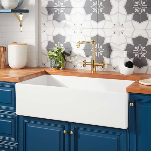
Kitchen Trends for 2019 – Part 1

Kitchen Trends for 2019 – Part 1

Kitchen Trends for 2019 – Part 1

Whether your home is a simple ranch or an elegant Georgian, one thing remains true, transitional style still rules. This style is a balance between traditional and modern. While it incorporates many trends, it also freshens interiors without straying too far from the familiar. It’s timeless and ages well! Transitional kitchens are all the rage in 2019. With so many new collections of materials, colors and innovative cabinetry, this trend is here to stay.


Window Walls

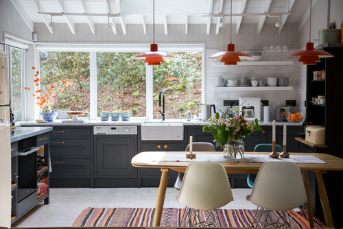
Homeowners across Atlanta are opting to remove upper cabinets for windows walls to bring in natural light and accentuate the outdoors.  Thus, kitchen designers are creating deep drawers on the perimeter and base cabinets for extra storage.


Full Tiled Focal Walls

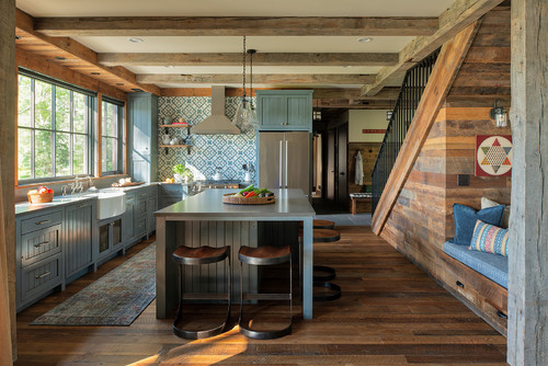
A full tiled backsplash becomes a feature wall that draws the eye.  Anything goes, from Moroccan patterns to stacked subway tile. Buying a few extra square feet vs. purchasing a group of upper cabinets, is so much more cost effective and looks very high end.


Go Against the Grain

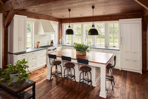
Wood on wood is becoming more and more popular, thanks to the farmhouse trend of the last years. Medium wood tones are making a comeback. Wood adds charm and warmth to a kitchen and pairs well with gray and white cabinets and walls.


No Two Whites are the Same

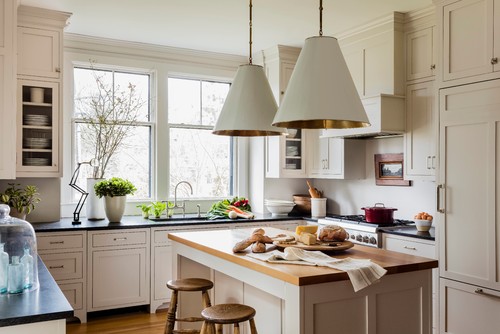
There is no denying that light colored cabinets are a favorite choice in kitchen design.  Instead of bright white, opt for an off-white or cream cabinetry to create impact. In the kitchen above, the cream cabinets pair perfectly to its crisp white walls, while the wood floors warm up the space.


No End in Sight for Quartz

The timeless look of quartz continues to be the #1 choice in countertops. Mimicking the look of more expensive countertops like marble and slate, quartz is still the most requested material in kitchen remodels.


Bold Color Reins

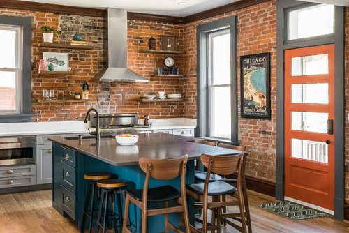
Darker jewel tones such as teal and emerald are bold and beautiful!  Adding a deep pop of color will anchor the island and create a more subdued color palette.
No matter how we look at it, from want-to-be chefs, too busy families, the kitchen is the center of everything that speaks HOME. It’s the room where function and beauty go hand in hand.
Melanie Serra, Interior Designer & Home Stager
Melanie Serra, Interior Decorator, Certified Color, Redesign and Staging Instructor

Award-winning decorator and stylist Melanie Serra has been reviving interiors for over 17 years and has worked with clients in Dallas, Philadelphia, and Atlanta. Melanie Serra’s approach to interior design is fresh and innovative transforming residential and commercial interiors from Now to WOW!

Melanie Serra Interiors - 770-714-3430